
The 3-Color Rule: The Silent Secret to Looking Instantly Expensive
You know that feeling. You pick pieces you love individually. You put them on, step in front of the mirror, and the magic disappears. It looks busy. Chaotic. Like you tried too hard, even though you didn’t. The clothes aren’t cheap, you didn’t gain weight, but the reflection lacks that polished pull you see on women walking down Queen Street or on Madison Avenue.
It’s almost never the price tag. It’s the number of colors fighting for attention.
In a world obsessed with loud trends, real elegance whispers. The women who consistently look like they stepped out of a luxury editorial don’t have a bigger wardrobe. They have a boundary. Stylists call it the 3-Color Rule, and once you see it, you can’t unsee it.
Why too many colors make an outfit look messy
Your eye wants harmony. When an outfit has five different colors – pink top, blue jeans, green bag, white sneakers, yellow scarf – your eye doesn’t know where to rest. It jumps. That jumping creates visual fatigue. You look at the clothes, not the woman.
We associate lots of contrasting colors with casual, youthful, sometimes disorganized. We associate limited palettes with maturity and wealth. Think about a high-end boutique in Yorkville or SoHo. You don’t see a rainbow inside. You see cream, beige, charcoal, maybe a touch of brass. The 3-Color Rule applies that same architectural thinking to your body. When you limit to three distinct shades, people see the silhouette, the drape, the fit – and you.
Read more: The Classic Style: How to Look Elegant Without Trying
I learned this the hard way in 2022. I wore a rust orange sweater, olive pants, a camel coat, white sneakers, and a blue tote to a client meeting. Individually, I loved each piece. Together, I looked like a mood board that fell over. My client, who is 58 and always looks expensive without trying, was wearing navy trousers, a cream sweater, and a burgundy bag. Three colors. She looked like $10,000. I looked like I got dressed in the dark.
What the rule actually is
Never more than three main colors in one outfit.
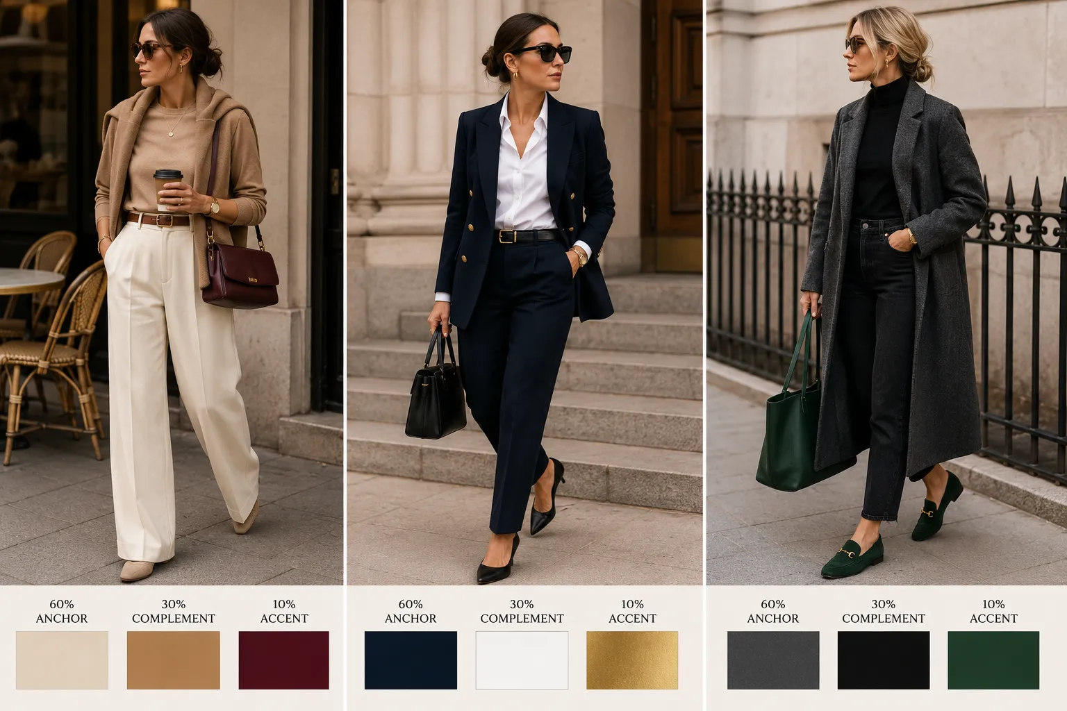
But don’t split them equally. Borrow the 60-30-10 rule from interior design, because it works the same on a body.
60% is your anchor. The biggest surface. A dress, a suit, a long coat, or head-to-toe denim. For the most expensive result, make this a deep neutral. Not bright red. Navy, charcoal grey, camel, chocolate brown, black, cream. In Toronto winter, my anchor is often my camel wool coat. It covers 60% of what anyone sees.
30% is the support. It gives depth without competing. If your anchor is outerwear or bottoms, your support is usually your blouse, sweater, or the top half. My anchor is camel coat, support is dark straight jeans and a white t-shirt. Or anchor is navy trousers, support is a crisp white button-down.
10% is the accent. This is where personality comes in. It keeps the outfit from looking flat or like a uniform. It’s almost always accessories: a burgundy leather crossbody, gold hoops, a silk scarf, forest green loafers. Ten percent is small. That’s why it pops.
Why three is the sweet spot
One or two colors – monochromatic – is elegant, but hard to pull off daily without looking like you’re wearing a uniform. I tried all-black for a month. I felt chic for three days, then bored and a bit severe.
Four colors is where it tips into clutter. You cross from intentional to busy.
Three gives you enough variety to show you have personal style, enough restraint to stay sophisticated. When you stick to three, you automatically get that quiet luxury look everyone talks about but no one can define. It’s not about logos. It’s about intention. You stop throwing on a random cardigan just to stay warm and start choosing a layer that mathematically fits.
Read more: Why Do Some Women Look Ten Years Younger? The Quiet Habits Behind Timeless Beauty
How I actually wear it tomorrow morning
I don’t want theory. I want what to wear when I’m late.
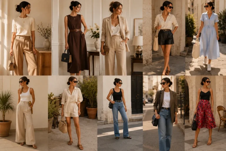
Look 1: Weekend brunch on Ossington. I call this old money without trying. Anchor 60%: cream wide-leg linen trousers – I got mine from Oak + Fort, $78. Support 30%: camel fine-knit sweater, draped over shoulders or worn loose, also from Oak + Fort years ago. Accent 10%: deep burgundy structured crossbody bag I bought secondhand on Poshmark for $95, and tortoiseshell sunglasses from Simons. Why it works: cream and camel blend seamlessly and look expensive together even if they’re not. Burgundy grounds it.
Look 2: For work. Anchor 60%: navy blazer and matching navy trousers – not black, navy is softer and looks more expensive in daylight. I got my set from Aritzia on sale. Support 30%: white cotton button-down, men’s cut, slightly oversized. Accent 10%: gold. Chunky hoops from Mejuri, $75, and the hardware on my black belt. That’s it. No other jewelry. People think I spent more than I did because navy + white + gold is a classic expensive combination that brightens the face.
Look 3: Errands, when I want to be comfortable but not look like I gave up. Anchor 60%: charcoal grey wool-blend long coat. Support 30%: black turtleneck and black straight jeans. Accent 10%: forest green tote or suede loafers. I wear this to Loblaws and to pick up my kid. It’s comfortable, warm for a Canadian fall, but the strict adherence to grey, black, and one pop of green elevates it far beyond casual.
The exceptions that keep you from feeling trapped
Metals usually don’t count. The silver zipper on your bag, the gold buckle on your belt, your delicate studs – your eye reads those as texture, not color. Until it’s huge. If you wear a massive gold statement necklace, that becomes your 10%. Count it.
Blue denim gets a free pass. Classic mid-blue jeans operate like a neutral canvas now. If you’re wearing white shirt, camel coat, and red bag, you can wear blue jeans without feeling like you broke the rule. Your eye filters denim as texture, not as a fourth color.
Texture can replace a third color. If you only want to wear two colors, you need texture variation. Black and cream could be boring if both are smooth cotton. But a chunky knit cream sweater with sleek black leather trousers and matte suede boots – the variation in fabric creates depth. The eye reads texture as interest, so you don’t need a third hue.
Patterns are tricky. If you wear a floral skirt that already has four colors in it, you broke the rule before you put on a shirt. If you love prints, choose ones with only two colors – black and white houndstooth, navy and cream stripe – and let your accessory be the third. I learned this after buying a beautiful skirt with pink, green, yellow, and blue flowers. I never wore it because nothing matched. It sat in my closet for a year.
Read more: Summer Fashion Essentials: How to Build a Chic Capsule Wardrobe for Hot Weather
What it does to your mornings
This rule isn’t about limiting self-expression. It’s about freeing you from decision fatigue.
Before, I stood in front of my closet and wondered if a jacket went with shoes. Now I count. How many distinct colors do I see in the mirror? If it’s four, I know why it feels off. I remove one. Usually it’s the scarf or the bag. It takes 10 seconds to diagnose.
In the US and Canada, we have small apartments, long winters, and we walk a lot. We don’t need more clothes. We need clothes that talk to each other. When you edit down to three, every piece in your closet starts to connect. You stop buying random things because you can instantly see they won’t fit the equation.
Elegance isn’t genetic and it’s not about having a limitless budget. I spend less now than I did in 2022. Elegance is editing. Strip away the noise, keep three intentional colors, and you get noticed not for how loud your clothes are, but for how settled you look in them. And that settled feeling is what looks expensive.

Founder of MindSpaceGlow — I write about intentional living, mindset & productivity for a calmer life. Not a licensed therapist, but sharing practical, research-based tools that work in real life.
More about me →

2 Comments