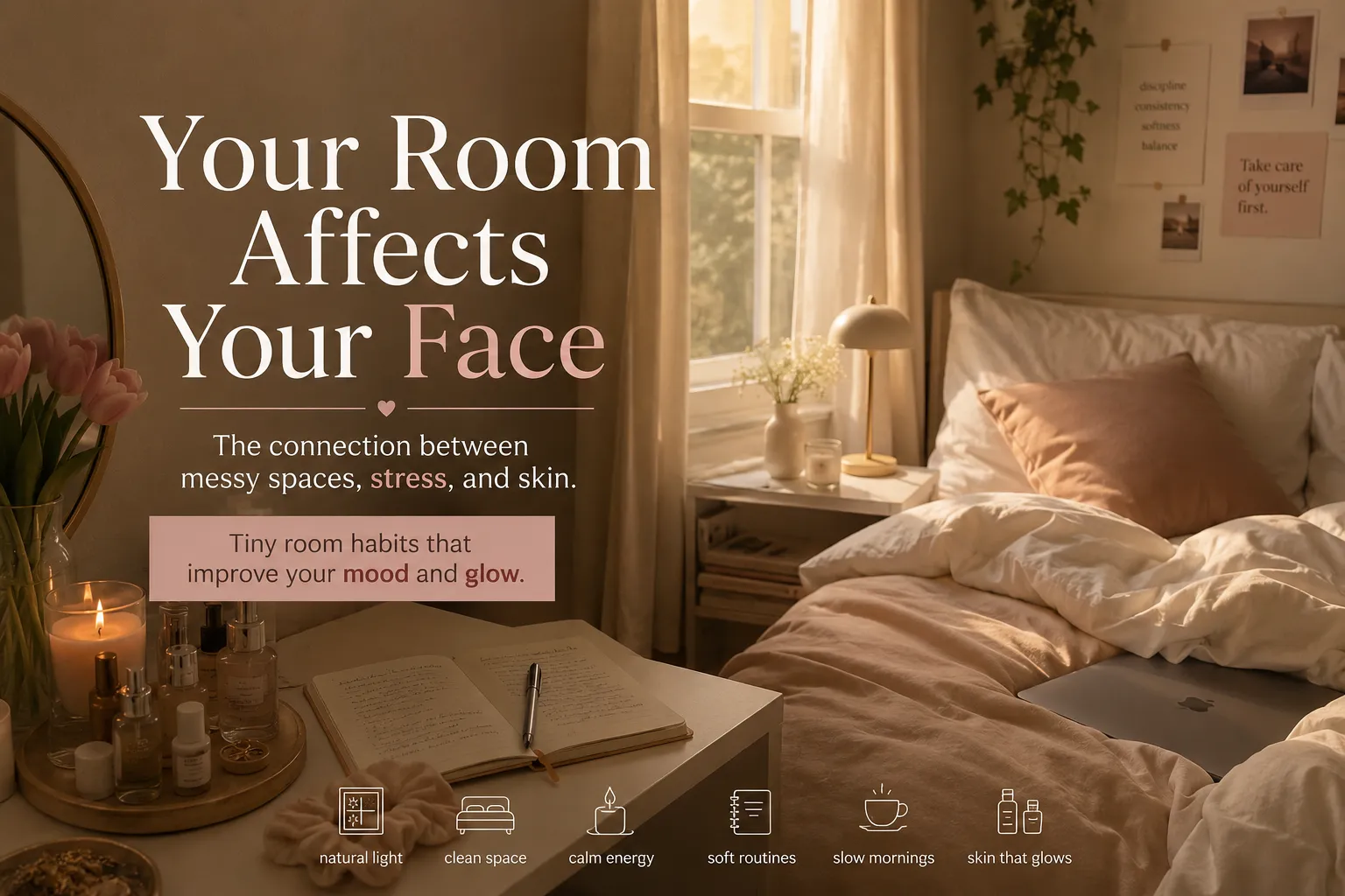
You have been told that a bold wall color or warm light bulbs will transform your space. They will not. The tricks that actually change how a room feels are far simpler and almost never discussed.
A designer I know once painted a client’s entire apartment the same shade of soft white. Not different whites. The exact same white on every wall, ceiling, trim, and built-in. The client cried when she saw it because the apartment felt three times bigger and completely transformed.
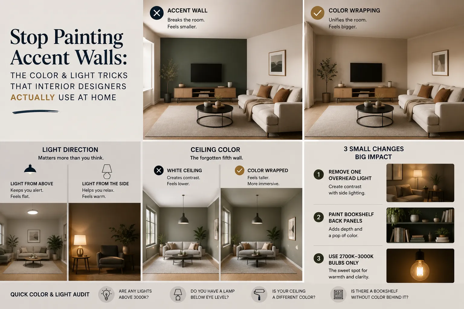
No accent wall. No bold color. No special light fixtures. Just the decision to stop doing what everyone else was doing.
Color and light are the most misunderstood tools in interior design. People use them like decoration when they should be using them like architecture. This article will show you the difference.
The Accent Wall Lie
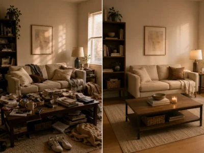
The accent wall became popular in the early 2000s as a way to add color without committing to it. The idea made sense on paper. In practice, it creates a problem that most people never identify.
An accent wall divides a room. It tells your eye “stop here.” It creates a visual boundary inside your space that makes the room feel shorter in one direction. And because it contrasts with everything around it, it becomes the only thing you notice in the room, regardless of what else is in it.
The alternative is something designers call color wrapping. Instead of putting one color on one wall, you bring a single color across all four walls and the ceiling. This removes the stop signals. The room reads as one continuous space. It feels larger, calmer, and more deliberate.
This works with any color. Deep navy on all four walls and the ceiling does not make a room feel like a cave. It makes it feel like a jewel box. The difference is whether you commit to it or hedge with contrast.
What Light Color Temperature Actually Does to You
Most people know that warm bulbs feel cozier than cool ones. But there is a detail nobody talks about: it is not just the color temperature that matters. It is the direction the light travels.
Light that comes from above (ceiling fixtures, recessed lighting) signals daytime and alertness to your nervous system. This is evolutionary. The sun is above you. Daylight means activity, vigilance, and being seen.
Light that comes from beside you or below you signals evening and rest. A lamp on a side table at shoulder height does more for the feeling of a room than any ceiling fixture, regardless of bulb color.
“Most homes are over-lit from above and under-lit from the sides. Fixing that one thing changes how people feel inside a space more than any paint color ever could.”
Residential Lighting Designer, New York
A simple experiment: tonight, turn off every ceiling light in your living room and use only lamps and standing lights. Live with it for one hour. Most people report that the room feels immediately more comfortable and more spacious. The room did not change. The direction of the light did.
The Color That Makes Every Room Feel Better
There is no universal best color. But there is a universal principle: the color with the most impact is the one on your ceiling.
Most ceilings are painted plain white. This creates a hard contrast with the walls and makes the ceiling feel high and hospital-like. When you paint your ceiling the same color as your walls, or a slightly lighter version of it, something unexpected happens. The room feels both cozier and larger at the same time.
The ceiling reads as a continuation of the walls rather than a separate plane. The room feels wrapped and intentional instead of boxed in. This is a trick used in boutique hotels and high-end apartments that almost nobody does at home because it seems strange until you see it.
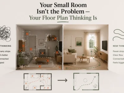
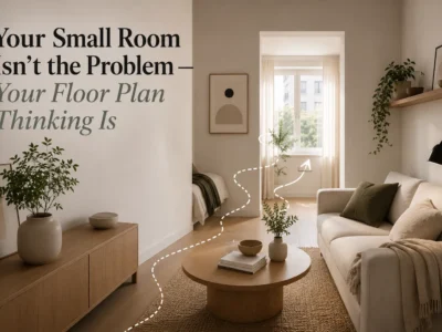
| Common Approach White ceiling, colored walls. Creates hard contrast. Ceiling becomes a visual cap that makes the room feel lower and more divided. | Designer Approach Ceiling matches or is slightly lighter than walls. Room reads as one complete envelope. Feels taller, more immersive, and intentional. |
Three Small Changes That Have Big Impact
Change One: Remove One Overhead Light
Most rooms have too many overhead light sources. Instead of adding lamps, try removing one overhead fixture from rotation. Designate one zone of your room that is only lit from the side. The contrast between lit and softly shadowed areas creates depth and warmth that even the best paint job cannot replicate.
Change Two: Paint Your Bookshelf Back Panels
This is one of the cheapest, fastest color moves you can make. The back panel of a bookshelf is a small, protected surface. Painting it a deep, saturated color (forest green, navy, terracotta) while keeping the shelves and frame in a neutral creates the effect of color depth without committing to a full wall. The objects on the shelf appear to float against the color. The whole room gains a visual anchor.
Change Three: Use Bulbs Between 2700K and 3000K Only
This is specific and it matters. Below 2700K (very warm, amber light) is pleasant but can make colors look muddy. Above 3000K starts to feel clinical in living spaces. The 2700K to 3000K range gives you warmth without distortion. It makes skin tones look healthy, food look appealing, and rooms feel inhabited rather than empty.
If you are unsure what your current bulbs are, check the packaging or the bulb itself. Most standard bulbs are printed with the Kelvin number (K). Replacing a single 4000K bulb in a warm room with a 2700K one is often the only change the room needed.
Quick Color and Light Audit
- Are any of your light sources above 3000K? Replace them first.
- Do you have at least one lamp below eye level? Add one before anything else.
- Is your ceiling a different color from your walls? Consider wrapping them.
- Is there a bookshelf with white or bare back panels? Paint them.
- Is there an accent wall creating a visual stop in the room? Consider neutralizing it.
The One Color Rule That Simplifies Everything
If you are overwhelmed by color choices, use this rule: pick one color and put it in three places at different intensities.
For example, if you choose green: a soft sage on the walls, a medium forest green on the bookshelf back panels, and a deep hunter green on one piece of furniture or a large cushion. Three intensities of one color create cohesion without matching. The eye reads it as a system and the room feels designed rather than assembled.
This rule works with any color. It is the reason rooms in magazines always look put together even when the furniture is mismatched. They share a color at different intensities. That shared thread is what the eye responds to.
What to Try This Weekend
You do not need paint or new bulbs to start. Tonight, turn off your ceiling lights and use only lamps for one full evening. Notice how the room changes. Notice where it still feels flat or uncomfortable. Those spots are where you need either a new light source or a color anchor.
Most people who do this realize they have been fighting their rooms with the wrong tools. Not more color, not bolder choices. Just light coming from the right direction, and color applied as a complete system rather than a series of small decorating decisions.
That is the whole shift. And once you see it, you cannot unsee it.
Start with One Lamp Tonight
Turn off every overhead light and use only side lamps for one evening. This single experiment will show you exactly what your room needs next.